I thought this week that I probably wouldn’t update because I didn’t have anything too terribly exciting to show off but I talked myself into it as the week went on partially because I’m curious to see what people think about the current state of the base. Let’s take a look at it and I will explain further.

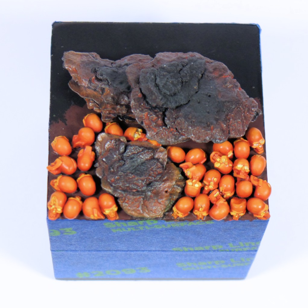
As you can see, more skulls are done and I added some OSL/fire effects to the rocks. I think the little rock is a bit overdone around the edge and I may need to repaint it and tone that down but I’m curious to hear what you all think. What do you think of the lighting effects? Does one of the two rocks look better than the other to you? To be honest, I’m just improvising and hoping that it works out so any feedback or consensus amongst the comments is very useful.
While the base took up most of my time this week, I did go back and work a bit more on the Fallout junk barricade. I started working on the concrete blocks but ran out of time to finish them unfortunately. I did get the trash can done though. It will get a healthy dose of rust which will give it more wear and tear which I think it needs at this point. It was pretty simple to paint overall and I like how the freehanded stripe came out. It looks fairly realistic, to my eyes anyway.

Everyone does get a reprieve from Comics Corner this week. I’ve been reading a series that is roughly 1500 pages long and I have about 300 to go so I will hold off and talk about it when I’m finished. I had a dentist appointment this week which just so happened to be in the Loop. As any Chicagoan will tell you, the Loop is the word we use here to describe the downtown area proper. I think its because of the shape of the sliver of land as its surrounded by water but I’m not entirely sure of the name’s origin. Regardless, I stopped by a comic shop for the first time in 5-10 years. Even though I’m going to stick with reading comics digitally because of a lack of space, I was happy to see they had Conan The Barbarian #1 and they had a series I’m really interested in called The Schlub #1. So I picked up both and don’t be surprised if you see mini reviews of those when I can get around to reading them. I’m mostly mentioning this because one long-time reader and commenter will be curious to hear more about Conan, I’m guessing.
I did want to give a belated shout out to Games Workshop who have been previewing some really cool miniatures recently. The most recent tease that caught my eye are these new Fyreslayer sculpts for Warcry.
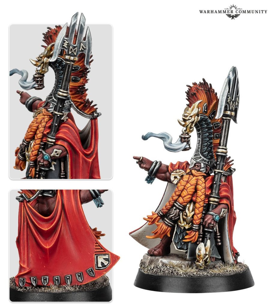

Both of these are quite nice and move away from the somewhat simple Fyreslayer sculpts that have been kicking around for a long time. I think there is an opportunity to make these less overtly fire themed as well. There is a whole squad of these coming and you can pretty much pick any of them and end up with a cool looking mini.
Next up we have another Warcry warband that is pretty cool. The Wildermore Hunters have a nice, gloomy look that the new Cities of Sigmar faction favors but I think these could work really well in a diorama with a Witchhunter mini. GW has released a few Witchhunters lately and the Underworlds one comes with some lackeys but I much prefer these new guys as potential foot soldiers myself. I think they have better posing and can tell a better story. I suppose I’m giving away free ideas here but I’m not sure if I’ll have the time to tackle the diorama idea that I have. There’s so many things I’d like to paint and not enough time.

And lastly, the real highlight for me is a model that might surprise you. Admittedly, I’ve never thought to myself, “But what I really want is to paint a unicorn…” and in this case, I really do.
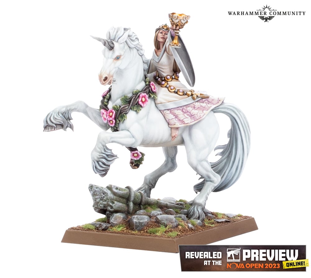
This miniature not only captures the Bretonnian faction really well but its such a clean design. Games Workshop minis are generally busy and that is part of their appeal to a display painter like me but this miniature has such a simple and clean look that its very appealing to me anyway. GW does not make a lot of female miniatures like this one either. She’s in a proper dress and there’s a lot of different ways you could paint it. I must confess that while I’ve never liked “cheesecake” or highly sexualized art, I’ve always admired people who can paint up or draw a great looking female. I think that’s an area I’d like to try and push myself in the future to broaden my skillset further. So yeah, I haven’t been this excited about a unicorn since I saw the unicorn scene in Witcher 3! Hopefully that gets a snicker out of somebody who’s played that game.
That’s all for me for another week. With any luck, I’ll finish up the base this upcoming week and potentially put the final touches on this long-running project soon.

Great progress on the skulls Jeff, personally I think the small rock has the right amount of light to it being closer to the heat of the skulls, also I think you need to brighten the area in the underhang of the larger rock, as that would catch a lot of light from the skulls.
The barricade is progressing nicely, and has plenty of detail to catch the eye.
LikeLiked by 3 people
I feared that I highlighted the little rock too much but I agree that the bigger rock is too dark at the moment. I’ll go back to it and push some more paint around to see if I can’t get it looking better. One of these days I might just get the barricade done too!
LikeLiked by 2 people
Aha, a “What Dave Stone said” moment again! Good progress Jeff! 🙂 Will be interesting to hear what Conan’s like as I was brought up on Savage Sword of Conan!
LikeLiked by 3 people
Cheers, John! Always good to hear what others think as you work on something tricky. I will certainly report back on Conan and I’m excited to read it! I can snap a picture or two of the comic instead of combing the internet trying to find a decent picture for once too.
LikeLiked by 2 people
Just curious, is it just going to be one layer of skulls or will they be built up under the layer of the larger rock? That would effect the highlighting.
The unicorn figure is very nice, but I wonder what is going on with the riders foot.
I finished the first compilation of Nocterra, very interesting and engaging. The library has the second compilation as well, unfortunately only in digital format. Unlike you, I do prefer holding a physical copy but understand the limitations of storage as I still have several boxes of comics from my son’s reading days.
And yes. Would be interested in the Conan.
LikeLiked by 3 people
That’s a good question. A single layer of skulls was my intention. That’s probably a good thing as I’m feeling ready to change gears soon.
That is a fair question about the foot. It didn’t stick out to me (no pun intended) until you mentioned it. Its interesting that there is no saddle used too.
I’m glad you liked Nocterra but that does sound like a dilemma. Are you going to give in to the easy access of digital or try and hunt down a physical copy? When I was buying trade paperbacks, I wasn’t collecting with the intent of collecting, I just bought comics that I really liked and I ended up with a closet full of them before I realized that it wasn’t sustainable. They’re heavy to move, for example and the paper eventually yellows and all that too. I do really like having the physical version, I just have no space to collect them and it seems wasteful to buy a physical version and donate it when I’m done like I do with most books.
I will definitely discuss Conan, probably even next week. I’m finished with the series I was reading so its time to turn my attention to some other stuff that is waiting on me to read.
LikeLiked by 2 people
But I LIKE cheesecake…
Rocks look fine to me. If I were to be super critical about the base; is there a plan for something like in between the skulls? Maybe bc the base is black but (to my untrained eyes) the gaps in between though small are jarring. They appear more like placed there rather than part of the ground. I dunno if it’s supported to be floating in something or whatever.
But I feel weird even saying that bc it’s all way better than I could do or even would try to do so don’t take me seriously. I’m tempted to erase this whole reply and start over just out of embarrassment at being nit picky but since you asked and I’m inherently lazy I’ll leave it. 😀
LikeLiked by 4 people
Being that you’re generally so light-hearted, I don’t know if you’re talking about actual cheesecake or art where women are barely clothes and well-endowed 🙂 Of course, you could be saying that you like both as well!
Its a great question. My initial plan was to put basing paste down underneath the skulls to give it some texture and potentially look like lava, but it just didn’t work. The skulls would squish it down so that the paste would get all over the skull and just not look very good. I’m going to try and make it look less black around the skulls near the end so we’ll see if that makes it look any better or not. Truthfully, I don’t know if the basing idea is really working out as well as I had hoped. Its not bad, but I don’t know if its great or even amazing either.
LikeLiked by 1 person
I agree with Dave regarding the stones and lighting.
The Fallout terrain is looking excellent. Really capturing the color palette nicely.
The new AOS human troops are growing on me. I was not keen at first but I am coming to like that they are something of a fresh Fantasy take rather than just historical.
Saddle a Unicorn? What?! Nay, I say neigh, er no. Of course she rides bareback… er. Forget I said that. I think the model looks good, except for that foot. I can not unsee that now. Thanks guys.
LikeLiked by 3 people
That seems to be the consensus so I went ahead and tried to address it. Thanks for the feedback, mate!
I know what you mean on the AOS humans. They’re not bad and really its just the horse anatomy that I have an issue with. If not for that, I’d love pretty much all of the minis they’ve shown off.
Haha, and fair enough on the saddle. The foot doesn’t diminish the mini much at all for me. I think it’d be a fun challenge to paint if I can find the time for it.
LikeLiked by 1 person
Good point on the AoS Human faction horses.
The camera angle may be what is making her foot look odd. I like that the model looks more “old school” Bretonnian, with a classic “dreamy” Thomas Mallory Authurian vibe than many of the newest “nightmarish” Bretonnian models.
LikeLiked by 2 people
Yeah, the lady on the unicorn puts the fantasy back in Warhammer Fantasy. I don’t mind the darker and grimmer side of Warhammer but I’d like to see the traditional fantasy side make a triumphant return with The Old World.
LikeLiked by 1 person
Some more light would help define the darkness….
LikeLiked by 1 person
Agreed. There isn’t enough contrast in the mini for my taste either. I would paint the mini differently than how the ‘Eavy Metal team approached it for sure.
LikeLiked by 1 person
That base is really coming together. I don’t mind the look of the Little Rock from the top. I think you need more on the edges however (the vertical strip around the rock), that’s the bit that would catch most of the light from the skulls and should be brightest in my opinion. Wish I could include a picture in the comment to highlight the area I mean!
The barricade looks great, keen to see it after you rust it up!
And yes some great models previewed recently, as you might expect I too am excited for the damsel!
LikeLiked by 2 people
I know what you mean on adding pictures! It would be helpful sometimes. I think what you’re saying makes sense. I’ve made some adjustments this week and I’m hoping that they will pay off. I wouldn’t be surprised if there aren’t further adjustments to go though.
I’m glad to hear you’re excited for the damsel too. She would slot in very nicely in your Bretonnian army, I would think!
LikeLiked by 2 people
The base is looking great mate. At first I was thinking the bigger one looked better with the OSL than the smaller one but the more I looked the more I though the smaller one would be showing more light because of its size whereas the bigger one would have a darker shadowy surface. Which is exactly what you’ve achieved so in all honesty both work really well in my opinion.
LikeLiked by 1 person
Glad to hear it! Thanks for taking a look and sharing your thoughts. Hopefully you like it even more as I put the finishing touches on it in the coming days.
LikeLiked by 1 person
I’m really enjoying what you’re doing with that base, keep it coming 🙂
LikeLiked by 1 person
Cheers, mate! I appreciate it 🙂
LikeLike